March 3, 2026
Color does more than decorate a room. It shapes mood, influences behavior, and subtly affects how we experience a space every day. From calming blues in bedrooms to energizing yellows in kitchens, the colors you choose for your home can either support your lifestyle or work against it. That's why thoughtful planning is essential when selecting paint, finishes, and furnishings.
Whether you're refreshing a single room or undertaking a full renovation, understanding color psychology can help you create a home that feels balanced and intentional. According to VeryWellMind, three of the main advantages of using color strategically in interior design include supporting focus, boosting performance, and even reaping therapeutic benefits. These effects highlight how powerful color can be when applied with care. In this article, we will explore how color psychology works and how to choose palettes that truly feel right for your home.
Understanding the Emotional Impact of Color
Every color carries emotional associations. While personal experiences and cultural influences shape how individuals respond to color, certain general patterns tend to hold true.
Blues and greens are commonly associated with calmness and stability. Reds and oranges often feel energizing or stimulating. Neutrals such as beige, gray, and soft white provide balance and flexibility. When planning a space, it's important to consider how you want to feel in that environment.
For example, a home office benefits from tones that support concentration. A bedroom may call for soothing hues that encourage relaxation. By aligning color choices with intended use, you create a cohesive atmosphere that enhances daily routines.
Homeowners who work with professional remodeling services often receive guidance on selecting colors that align with both design goals and emotional impact. This strategic approach prevents mismatched tones that can disrupt the overall harmony of a space.
Choosing Colors That Support Focus and Productivity
In areas where concentration matters, such as home offices or study spaces, color plays a significant role. Cool tones like soft blue, muted green, and gentle gray are often associated with clarity and mental calmness.
According to VeryWellMind, strategic color use can support focus and boost performance. In work-oriented environments, overly bold or saturated colors may feel distracting. Instead, subtle hues paired with natural light can create a setting that promotes sustained attention.
Accent colors can still add personality without overwhelming the room. For example, incorporating a deeper navy or forest green through furniture or décor maintains visual interest while preserving balance.
When coordinating updates through remodeling services, homeowners can integrate color planning into broader design decisions, such as cabinetry, flooring, and lighting, creating a seamless and productive environment.
Creating Calm and Comfort in Restful Spaces
Bedrooms and relaxation areas benefit from calming palettes. Soft blues, warm neutrals, lavender tones, and gentle earth colors contribute to a sense of tranquility.
These hues lower visual intensity, allowing the mind to unwind at the end of the day. Warm undertones in beige or cream create coziness, while cooler tones provide a refreshing and airy feel.
Layering textures within a similar color family enhances depth without overstimulation. For example, pairing a light sage wall color with cream bedding and natural wood furniture creates harmony.
When homeowners engage remodeling services to update bedrooms, designers often recommend paint samples tested under different lighting conditions. Natural and artificial light can significantly change how a color appears, so evaluating tones in real time ensures the final result feels inviting.
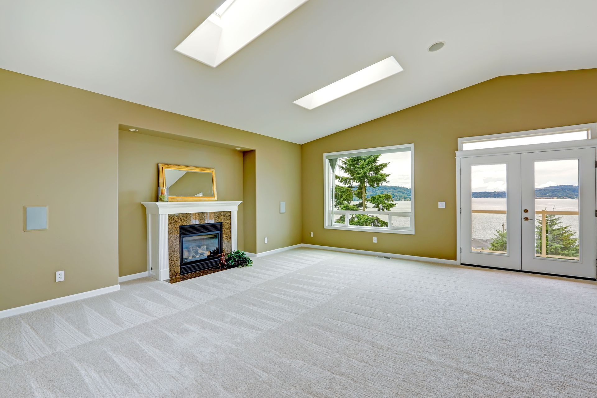
Energizing Social and Gathering Areas
Living rooms, dining spaces, and kitchens often serve as gathering hubs. In these areas, color can encourage conversation and activity.
Warm tones such as terracotta, muted gold, or soft coral introduce energy without feeling overwhelming. Even deeper hues like navy or charcoal can create a sophisticated yet welcoming atmosphere when balanced with lighter accents.
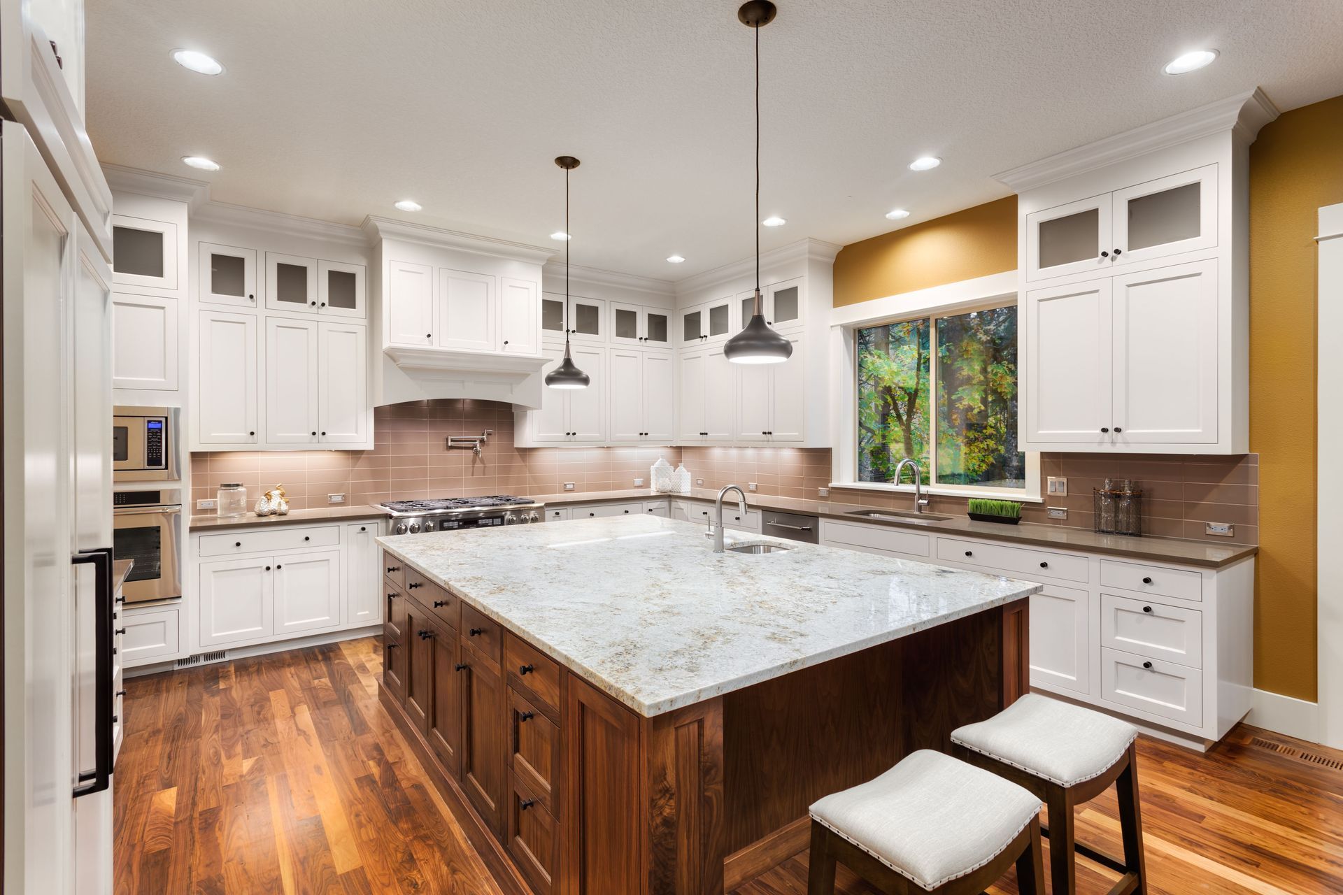
Kitchens, in particular, benefit from thoughtful color coordination. Cabinet finishes, backsplash materials, and countertop selections should work together cohesively. The right palette can make the space feel brighter and more open.
By consulting with remodeling services during kitchen or living area renovations, homeowners can achieve color combinations that reflect their personality while maintaining functionality.
Balancing Neutrals With Statement Colors
Neutrals form the backbone of many interiors because of their versatility. However, relying solely on beige or gray can sometimes leave a room feeling flat.
The key is balance. A neutral base allows statement colors to shine through accents like artwork, furniture, or feature walls. This approach provides flexibility, making it easier to refresh décor over time without repainting entire rooms.
For instance, a warm gray wall paired with emerald green cushions and brass accents creates depth and character. Meanwhile, a crisp white backdrop allows bold artwork to stand out.
Professional remodeling services often help homeowners strike this balance by selecting durable neutral finishes for large surfaces while incorporating color through adaptable elements.
Considering Lighting and Undertones
Lighting dramatically influences how color appears. Natural daylight brings out cooler tones, while incandescent lighting can emphasize warmth.
Before committing to a palette, it's important to test paint samples in various lighting conditions throughout the day. Undertones also matter. A gray paint with blue undertones will feel very different from one with brown undertones.
Ignoring these subtleties can lead to unexpected results once the paint is applied to an entire room. Careful evaluation prevents costly revisions and disappointment.
Remodeling services typically assess lighting during the planning phase to ensure chosen colors maintain their intended effect in every condition.
Reflecting Personal Style and Lifestyle
While general guidelines are helpful, personal preference should never be overlooked. Your home should reflect your personality and support your lifestyle.
Some homeowners prefer bold, dramatic palettes that create visual impact. Others lean toward understated tones that provide a minimalist feel. The goal is to select colors that resonate emotionally and practically.
Families with young children may choose durable finishes in forgiving shades that conceal wear. Individuals who entertain frequently might opt for vibrant tones that energize social spaces.
By working with experienced remodeling services, homeowners can align personal taste with functional design, achieving a result that feels authentic.
Using Color to Influence Perception of Space
Color also affects how large or small a room appears. Light hues tend to make spaces feel more open and airy, while darker tones can create intimacy.
In small rooms, soft neutrals or pale pastels can visually expand the area. Conversely, a large, open-concept space may benefit from deeper accent walls that define zones.
Strategic placement of color can highlight architectural features or downplay less desirable elements. For example, painting trim in a contrasting shade draws attention to craftsmanship.
Understanding these principles allows homeowners to shape how each room feels proportionally and emotionally.
Integrating Color Throughout the Entire Home
Consistency matters when designing a cohesive home. While each room can have its own personality, transitions between spaces should feel natural.
Selecting a base palette and building variations from it ensures flow. For example, using shades of blue and gray throughout different rooms creates continuity without monotony.
Open-concept layouts especially benefit from coordinated palettes. Abrupt color changes can feel disjointed, while harmonious transitions enhance visual comfort.
Remodeling services often help homeowners develop a whole-home color plan, tying together flooring, cabinetry, and wall tones for a unified appearance.
Embracing Therapeutic and Emotional Benefits
Beyond aesthetics, color offers subtle therapeutic advantages. As VeryWellMind notes, strategic color use can even contribute to emotional well-being.
Soft greens may evoke a connection to nature. Warm neutrals foster comfort and stability. Blues encourage calmness and clarity.
While color alone cannot transform mental health, it contributes to an environment that supports relaxation and productivity. Over time, these subtle influences can enhance overall satisfaction with your living space.
If you are planning a renovation or considering updates, partnering with professional remodeling services can help you develop a cohesive color strategy that supports your goals. Contact Haus Studio today to start transforming your home with palettes that truly feel right.